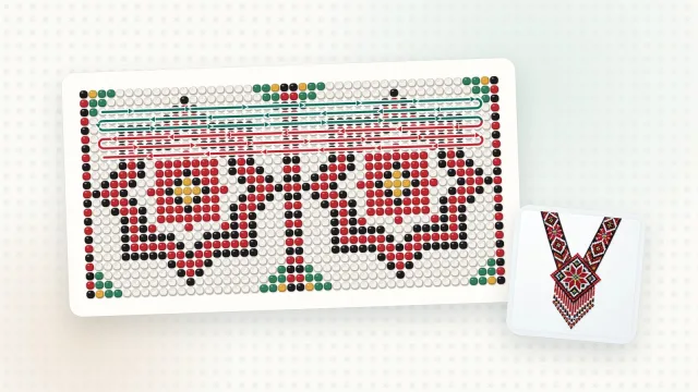
Even the most beautiful ornament can get lost when its colours blend. Here are five tips for choosing beads so that the pattern reads from afar and the piece looks whole.
1. Start with contrast
The motif should differ from the background in lightness, not just in hue: dark red on black blends in, red on white does not. A simple check: if the motif disappears in black and white, there isn’t enough contrast.
2. Fewer colours, a cleaner motif
A gerdan or a sylianka often needs only 3–6 colours. Every new shade makes beading harder and adds small specks. If two colours are almost the same, merge them into one.
3. Mind the finish
Matte, transparent, pearl or metallic beads of the same colour look different and catch the light differently. Combine finishes on purpose: for example, a matte background with a shiny motif.
4. Take colours from a manufacturer’s catalogue
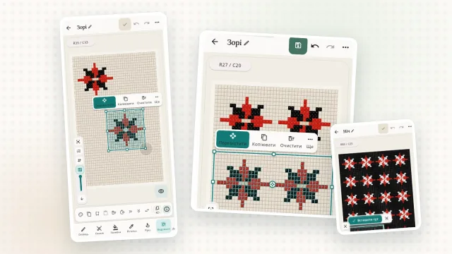
In Biser Studio you pick colours from the PRECIOSA, Miyuki, TOHO and other catalogues. The pattern then lists the codes of real beads, and the materials list shows how many beads of each colour you need. Save your favourite combinations as your own palettes to reuse them in new patterns.

5. Bead a test piece
Real beads can look different from the screen. Before you buy all the beads, make a small sample or at least lay the beads side by side in daylight.
Try a few colour combinations in Biser Studio and pick the one you like best.